
Disclosure: This is a guest article written by Sheena Yap, founder of Etsy Explores, who kindly accepted our invitation to join a Letterpress Workshop conducted by YY of Typesetting.sg on Culturally.
I have a weakness for typography. There’s so much beauty in the art of different types - each with their own distinct character - coming together to convey a unique message. So when I saw that a letterpress class was available on Culturally.co, I was instantly hooked.
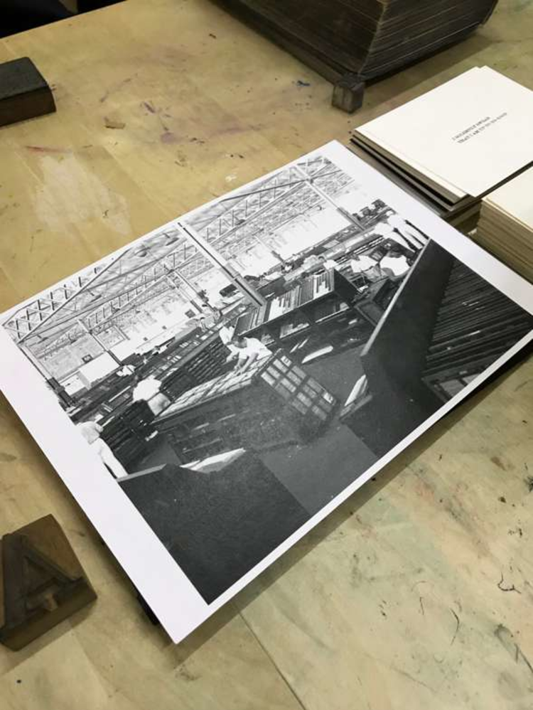
The class was led by YY, a self-taught printer (as he likes to call himself) who began his journey in letterpress when he realised how much it embodies the fundamentals of graphic design. He started the class by sharing with us the fascinating history of letterpress - how it revolutionised the print industry and enabled the Renaissance because it allowed for mass printing. Although it was brought by the missionaries to Singapore in 1819, it was quickly substituted by more efficient machinery. While it is sadly considered a “lost art” here, YY is one of the artisans who wants to “lend a voice” and speak up for the traditional form of letterpress.
The basics of typography
Did you know that letterpress printing is unique? We needed 4 different setups because we had 4 different languages to print!
After wow-ing us with his impressive knowledge of the history of letterpress, YY demonstrated the fundamentals of placing and arranging the leadings and types together in the type cast. I’ve always thought that design was very intuitive and based on feels. But it was fascinating to see how there’s actually so much math that actually goes on behind this process!
Then, it was time for us to create our own print. Funnily enough, the first step was the hardest for me: deciding on the quote I wanted to print.

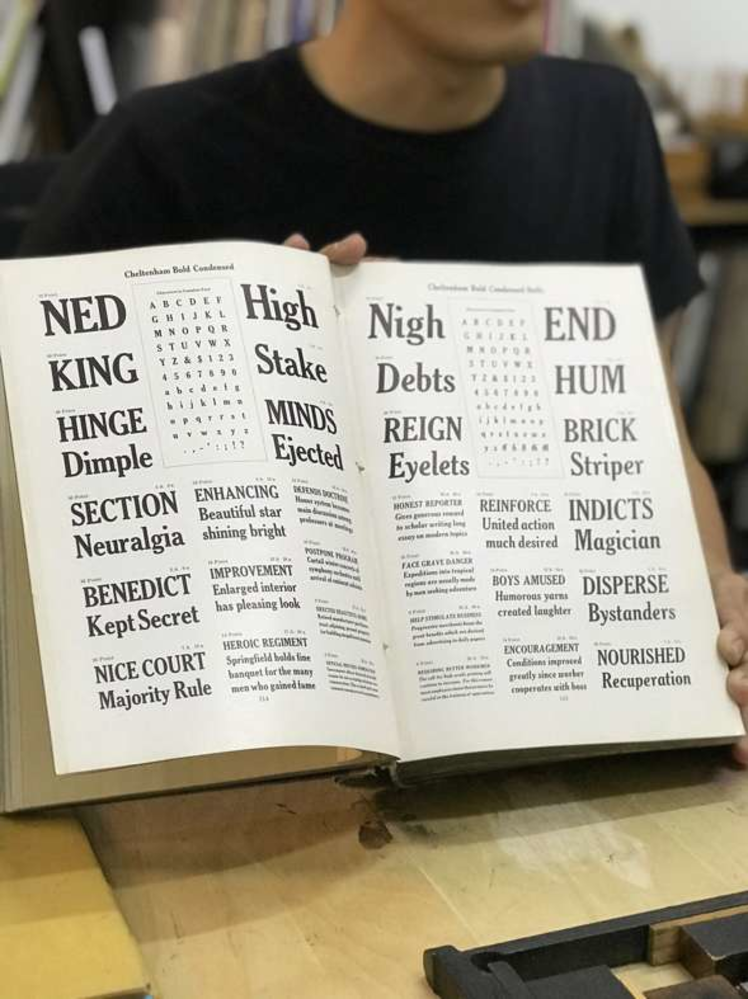
Examples of letterpress prints – I was so tempted to ask if I could stay for the whole day to create more prints!
Tip 1: I would highly recommend doing some research and scouring Pinterest before the class.
Tip 2: Don't be too ambitious!
Thankfully, YY had lots of amazing samples from his previous classes and personal collection, and that definitely provided a lot of inspiration. I wanted a quote that was timeless and would serve as a good reminder in most contexts, and after frantically scouring through Pinterest, I finally found one. Then, I had to design how it would be laid out and select the fonts that would best convey my message. It was fortunate that YY’s dizzying array of types and ornaments, sourced from all over the world, allowed for infinite possibilities when designing the quote! The extent of decision-making that had to be done made me realise just how much thought is required to conceptualise a seemingly simple print.

Types and leadings: just some of the many components that go into letterpress

Putting my quote together! This type cast actually gets pretty heavy with all that leading!
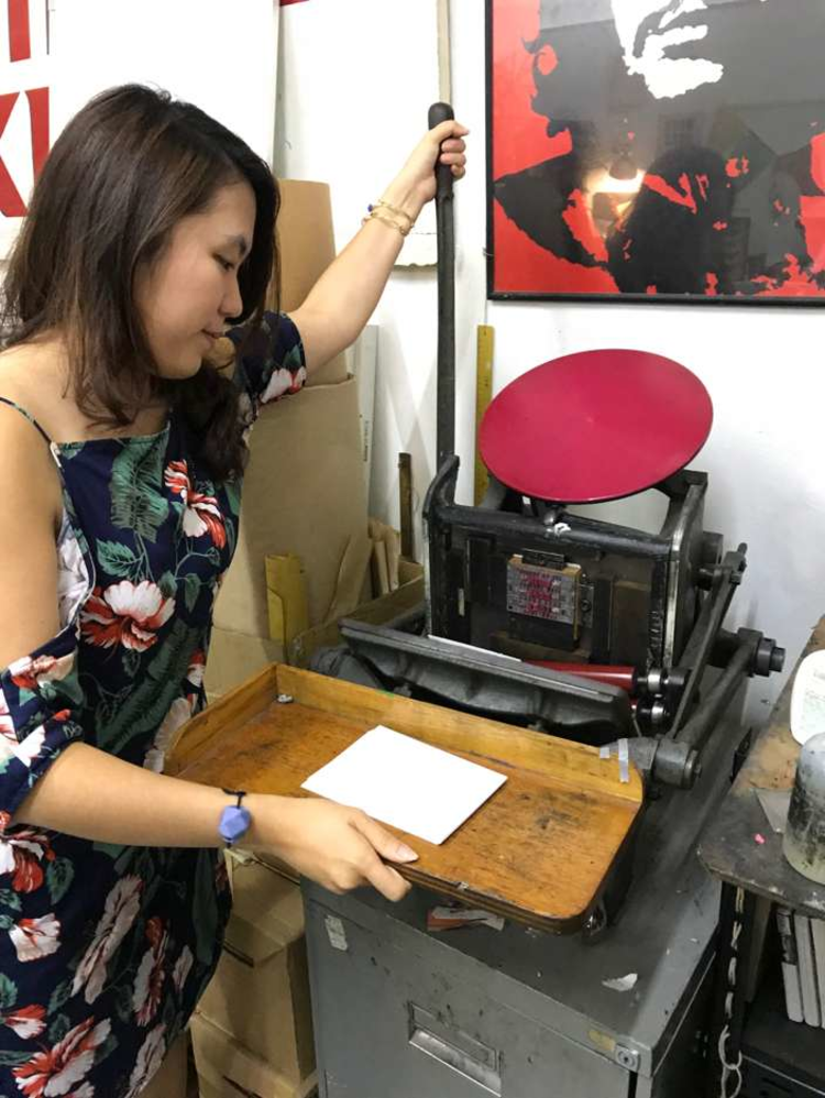
I was really excited to see how the final product would turn out, but little did I realise how much of my typecast YY would have to fix before it could be printed! I was in absolute awe of his expertise and amazing eyesight as he could identify where I had used smaller leading - mind you, these distinctions are a minute as 1pt - and patiently helped to make all these adjustments so that the print could be as perfect as possible. It was only after several iterations and tests with the printer that we were ready to go ahead with the mass printing!

Locking it in: getting the type cast ready for print!
Such a sense of satisfaction seeing all 15 prints produced beautifully!
There are so many things we take for granted these days with technology, and print is definitely one of them. With word processing softwares readily available, putting together a piece of text or even a card with beautiful typography is just so simple. But learning about art forms like letterpress reminds me that prints like these are truly a labour of love, and I definitely have newfound respect for all the printers in the past who had the mind-boggling job of putting together rows of text for the sake of disseminating information! If you’re already a design or typography lover, trust me, this class will make you love it even more.

Worried that you would only get one print and not know who to give it to? With 15 copies, you don’t have to fret.

Thanks YY for the wonderful letterpress experience!
• • •
Want to take a letterpress workshop too?
Book now on Culturally for 15% off your first order!